A self-published, 96-page annual on type and typography, drawing on a year of looking closely at letterforms in Latin and Persian. Edited, designed, and typeset in-house.
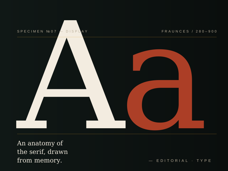
Every studio needs a side of its practice that is not for a client. Specimen is ours — an annual we publish in a single run of 800 copies, on whatever we have been thinking about that year. №7 was about the letter A: its anatomy, its history, and the way a single character can carry an entire identity.
We opened the issue with a 24-page visual essay on the construction of the capital A — drawn at display size, broken into its strokes, overlaid with the geometric systems that have been used to rationalise it across two millennia. The rest of the issue collects writing from six contributors on type in Persian, Latin, and the increasingly common space between them.
"We publish Specimen because someone has to write down what designers are actually thinking, in a form you can hold."
The annual is set in a custom display face we cut ourselves — a variable serif with an exaggerated optical-size axis, so the same family carries from 8-point captions to 280-point covers. We print it locally, on a press we know, and we hand-bind a small run of 50 with cloth covers for subscribers.
Specimen is now in its ninth issue. It does not make money and it is not meant to. It is the part of the studio that stays ours.