A complete identity, packaging system, and ceramic-led art direction for a Tehran tableware maker drawing on the geometry of the sofreh — the cloth spread for a shared meal.
Sofreh came to us with a factory in Sharifabad and a love for the formal logic of Iranian tableware — the way a dish is never just a dish, but a frame for bread, for saffron rice, for the geometry of a shared meal. They wanted an identity that felt contemporary but unmistakably of its place.
"We didn't want a logo. We wanted a mark that could be stamped into clay and still feel like ours a hundred plates later."
— Mahsa R., Founder, Sofreh
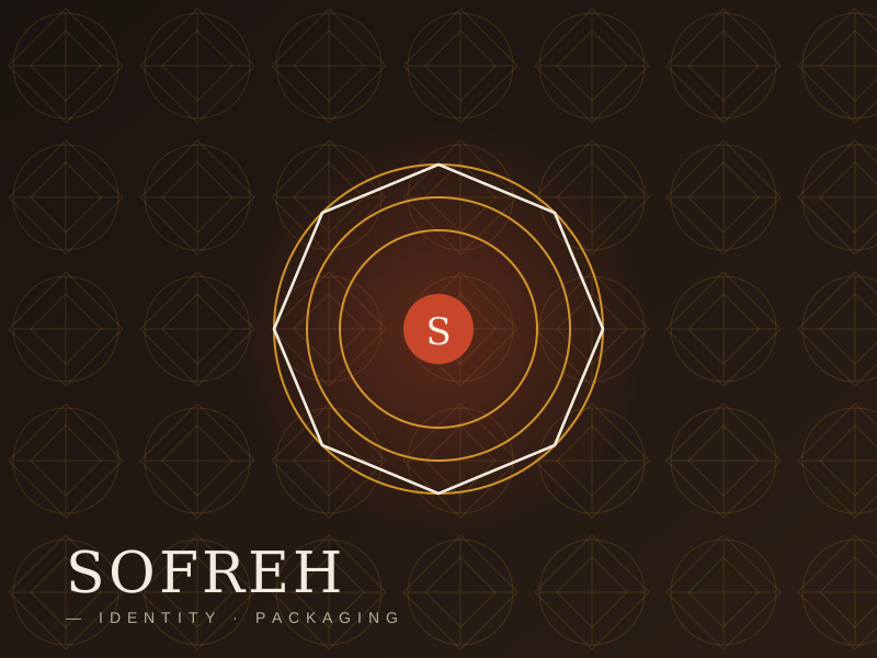
The wordmark is built on an eight-point star — the girih, the underlying geometry of Persian tiling. We extracted a single rotation of it and let the "S" of Sofreh sit inside, so the brand reads as both letter and ornament. It works as a ceramic stamp, a foil, or a one-colour print.
We pulled colour from the materials themselves: the raw terracotta of unglazed clay, the saffron-gold of a glaze fired just to its turning point, and a deep oxidised green borrowed from the copper Patinated bowls of the Qajar period. No synthetic colour anywhere in the system.
The result is a brand that reads as quiet on a shelf and warm on a table — which is, we think, what tableware is supposed to do. Sofreh launched in three Tehran boutiques in late 2024 and has since expanded to Esfahan and Shiraz.