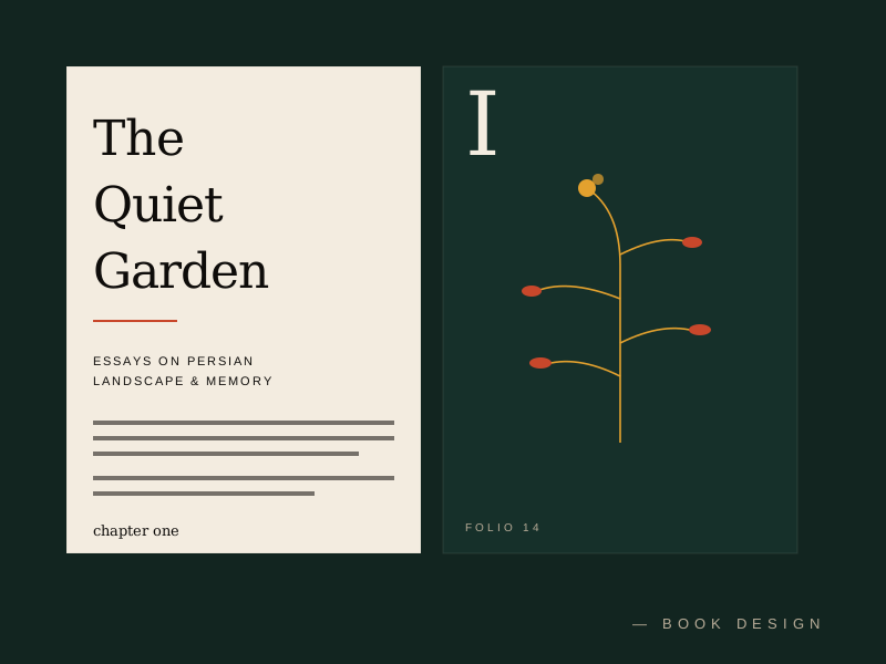
A margin is the part of a page that designers argue about most and clients understand least. It is the empty space around the text — top, bottom, outside, inside — and to anyone who has never had to justify it, it looks like waste. Why leave a third of every page blank? Why pay for paper you are not printing on?
This question came up on nearly every page of The Quiet Garden, and answering it well was the difference between a book that breathed and a book that suffocated. What follows is the answer we arrived at, in case it is useful the next time someone asks you to "use the space better."
The margin is not leftover page. It is the room the reading happens in.
The margin is not empty
The first thing to say is that a margin is not empty. It is full of the things margins do: it holds the page in the hand without the thumb covering the text; it gives the eye somewhere to rest between lines; it frames the type block so that the type block reads as a deliberate object rather than something that simply ran to the edge and stopped. A page with generous margins feels composed. A page with stingy margins feels like a flyer.
When we set The Quiet Garden, we gave the text block a margin of almost a third of the page width. The publisher's first reaction was that we were throwing away paper. Our reply was that the paper was not being thrown away — it was being used as a margin, which is one of the most important things paper can do.
The thumb
The most practical function of a margin, and the one most often forgotten, is the thumb. A reader holds a book, and the place they hold it is the inner margin. If that margin is too narrow — and it is too narrow in a startling number of contemporary books — the reader's thumb covers the ends of the lines, and they have to shift their grip to read the text. This is a small friction. Across three hundred pages, it becomes a large one.
The inner margin on The Quiet Garden is wider than the outer, which is the correct orientation and which most mass-market books get backwards, because the cost of paper is counted more carefully than the comfort of the reader.
The inner margin should be wider than the outer. Most books get this backwards because paper is counted more carefully than readers.
The hierarchy of the page
A margin is also how a page tells you what is important. Running heads, page numbers, chapter titles — these live in the margin, and their placement there is what tells the reader, without ever announcing it, that they are metadata and not text. A page number set in the text block, rather than in the margin, reads as a line of content, which is why it never quite works.
We used the margin on The Quiet Garden to hold a quiet hierarchy: chapter numbers in the top outside corner, the book's title in small caps at the foot. A reader who wanted to orient themselves could. A reader who did not was never interrupted by it.
The reading room
But the deepest function of a margin, and the hardest to defend because it is the least quantifiable, is that it gives the reading room. A page crammed to its edges with text feels anxious, as if the words are trying to escape. A page with room around its text feels calm, as if the words have been given the space to mean what they mean. This is not a measurable effect, and we would not pretend otherwise. But it is the effect that decides whether a reader wants to keep turning the pages.
So the next time you are asked to use the space better, the answer is: we are. The margin is not where the page ends. It is where the page begins to work.